
cover win or cover fail?
So I’m reading the On the Hunt anthology, & I’m enjoying it so far. Gena’s story was exceptional, as usual. :happysun
But I just cannot seem to get past the cover. Look at this thing:
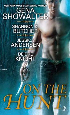
Now, I’ll concede the fact that it’s 85%  . Love the colors & layout, & that guy’s body is not one I’d kick out of bed for dragging along a bloody scimitar.
But that face! Oh, the face. :nowait
I’m not sure if you can tell here, but close up, the guy looks to be about 13-years-old. Seriously, he could be the kid who mows my lawn. So every time I pick up the book, I think, Ooh, hot…hot…EEP! :patrick4
Luckily, I’m not a gal who judges a book by its cover. Well, I do—but only as a first impression. Then I let the writing itself form my opinion. So I’m happily moving forward, even though I do find this particular cover distracting, to say the least. (I’m actually considering sticking a little post-it note over just the face for the rest of the time I’m reading. :bubble )
So what do you think of this cover? Do you find the youthful look of the hero as distracting as I do, or do you think he’s just plain , regardless? :bed
And do you tend to judge a book by it’s cover, or are you cover blind? :Cukoo
Comments
13 Comments • Comments Feed
Mary Kirkland says:
He doesn’t really look all that young to me. I love that they didn’t cut his head off. I have a real problem with headless torso’s on book covers. I really do. I think if you look at his lips and chin and can make out the fine line of facial hair you can trick your mind into thinking he’s just a youthful looking 21 year old. lol
I do look at book covers but if the story is good, I’ll forgive the bad book cover. lol
On July 30, 2012 at 1:49 am
Heidi says:
Oh, see, I like…or at least don’t mind…headless hunk covers. Sometimes they work better for me, because the body can be great, but I like to visualize h/h faces on my own. :howyoudoin
On July 30, 2012 at 10:05 am
Jessica Lemmon says:
This is when a Kindle comes in handy! :roadrunner
On July 30, 2012 at 6:52 am
Heidi says:
LOL Very true. Altho I must admit, I like seeing the cover each time I pick up a book & before I go back to reading. It grounds me, I think; instantly tosses me back into the story. :cool
On July 30, 2012 at 10:07 am
Anne says:
Model is great, the sword’s a little small…not that I’m judging anything else by the size of the sword.
On July 30, 2012 at 7:27 am
Heidi says:
*snork* :lolol Be glad you can see his sword at all. In one of the story, the hero’s sword is…invisible. :howyoudoin
On July 30, 2012 at 10:07 am
Kathleen O says:
He looks young to me, but that is only because I am older… :lolol . But I must admit…his eyes are kind of weird, scary type…You know those haunted kind… But I guess that is what this book is all about..
On July 30, 2012 at 9:54 am
Heidi says:
You know what’s funny…? In this image, his face looks older & the glow of his eyes is more prominent. On the copy I have (print hardback), the face looks super-young & the eyes look almost completely normal. How weird is that?
But, yes, the glowing eyes are supposed to represent the paranormal elements of the stories. 🙂
On July 30, 2012 at 10:09 am
Pamela Cayne says:
I kind of skim covers and as long as they’re halfway decent, will judge them by the writing more than the pretty pictures. E-books, however, are a different matter. Some of those are so hideous I cannot look inside…
On July 30, 2012 at 10:02 am
Heidi says:
Ha! I couldn’t agree more. For me, I won’t *judge* a book by its cover, exactly, but a really good cover can certainly draw me in faster (& I’ve been known to buy books simply *because* of the cover) & a bad cover can make me avoid a book longer.
What I think is fun is when you find a really good book with a really good cover or a really bad book with a really bad cover, then can point & say, “See! See! You *can* judge a book by its cover.” :evilmonkey
On July 30, 2012 at 10:12 am
Michelle Bledsoe says:
:scratchhead I’m sorry, but the first things I noticed was the small swordy thing and his funky eyes.
I tend to look at the bodies on the cover especially the tattooed ones. The faces are usually the last thing I look at… :howyoudoin
But yeah, I do get distracted by a bad cover even though the book is amazingly good.
On July 30, 2012 at 10:37 am
Tammy Beck says:
His body is definately hot but not the face. It’s not that he just looks young, he just doesn’t do it for me.
I hate when h/h on the cover is blonde & blue eyed on the cover but described black hair & green eyed in the book….drives me crazy. Match the looks or leave the heads off.
I have learn never to judge books by the cover. There are plenty of great books with boring covers. I read excerpts to decide if I’m interested.
On July 30, 2012 at 12:02 pm
Ruth Chestnut says:
I think what draws me to a book first is the cover. Not so much what is on there, but the colors. With this book though it was Gena Showalter’s name that caught my attention, along with Jessica Anderson’s. As I have read many books by both authors and know that they tell good stories. He does look a little young but more in his 20’s to me.
On July 30, 2012 at 7:58 pm