artwork made easy

Editor C: “It’s time to start working on the cover for PROJECT: RUNAWAY BRIDE. Do you think you could fill out the Art Fact Sheet by next week?”
Me: “Sure!”
Rush to eHERS, Harlequin’s online database where authors fill out their Art Fact Sheets & keep other bits of information up-to-date.
Start filling out the AFS for PROJECT: RUNAWAY BRIDE. The character descriptions are easy… I used Clive own as inspiration for the hero, Reid McCormack, & Kate Hudson as inspiration for the heroine, Juliet Zaccaro.
Next, come up with three scene ideas from the book that would look good on the cover.
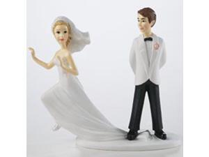
Okay, Number 1… Well, a runaway bride would be good. Heroine in a wedding dress, looking like she’s fleeing, but maybe being tugged back by our sexy, tuxedo-clad hero. Mmm-mm.
Number 2… Well, there is a kind of romantic scene in front of the fireplace in the hero’s study. I don’t love that idea as much as the runaway bride one, but okay.
Number 3… Hmm. *think, think, think* Okay, well, a fairly significant part of the story takes place at the heroine’s family lake house. But I don’t particularly want to see a cabin in the woods on the cover. That’s more of a Special Edition sort of thing, don’t you think?
Number 3…
Number 3…
I continue to wrack my brain, but without much luck. Then I had a new filling put in, & despite the dentist’s claims that “we’ve really come a long way in pain medications,” the agony struck almost the minute I walked out of his office. Not only did that tooth hurt, but both my top & bottom jaw all along that side throbbed for a good week, & it moved up into my brain to include what I’ve not-so-lovingly dubbed a “dental headache.”
Three or four days after the dental work, I realized I haven’t yet completed the Art Fact Sheet that was due…oh, shit!…:kittyquestion yesterday.
So I e-mailed Editor C…
Me: “Oh, dear, I’ve dropped the ball.” Short explanation of dental agony & mush-for-brains that apparently accompanied my new filling. “I filled out all of the major stuff, but only did one or two scene ideas because I honestly couldn’t think of another really good one for the cover.”
Editor C: “That’s okay, I think we’ve got enough.”
A week or two passes before I talk to Editor C again & ask about the cover art.
Editor C: “Oh, yeah, we had our meeting about that last week. Basically, she’s going to be in a wedding gown kind of looking like she’s running away, but with the hero grabbing her in some sort of embrace.”
 Me: “That’s exactly what I suggested! I couldn’t even think of better ideas because the story is called RUNAWAY BRIDE, after all.”
Editor C: Chuckle. “Yeah, that’s pretty much how it went. I said, ‘Two words: Runaway Bride’ & the art department is going with it.”
So now we just have to wait & see how the final cover turns out. But seriously, with a title like that—easiest. artwork decision. ever. :laughing
Comments
5 Comments • Comments Feed

Mary Kirkland says:
I can draw about as good as that guy in the picture. lol
Looking forward to seeing the cover and reading the book.
:goteam
On July 11, 2013 at 5:26 am
Kathleen O says:
God gave me other talents.. Artistic talent passed me by :snickerdog … I can draw a few things, but like the above, stick figures are more my style..
On July 11, 2013 at 8:53 am
Hollie says:
Now I’m anxiously waiting to see the cover AND read the book!! :hugpuppy
On July 11, 2013 at 11:15 am